Designing with Cyberpunk
Motivation
Creativity is self expression and self expression is difficult for overly analytical minds. Software engineers are as analytical as you can get. As a software engineer myself, I have the hardest time producing images from the ideas in my mind. But none of that has stopped me from trying.
Vision
My vision for my website and my blog was based on my favorite literary and artistic genre: cyberpunk. This goes back to how I view the world — a desolate and hopeless place, where everything competes for survival for as long as possible, only to perish at the end, leaving a mark on the universe as significant as my vote in the elections. I digress. Cyberpunk: it's futuristic! it's dystopian! it's dark! (lit with nothing but neon, so much neon!) It also tends to be minimalistic at times which I really enjoy. I can't put into words how much I love seeing a well-executed cyberpunk aesthetic; it draws me like peanut butter does a dog.
Design Process
My design process goes as follows; Come up with an idea, an aesthetic (based on a feeling, mood, or message you want to express); then look for other works that capture that idea well, and clash those works together to make something brand new!
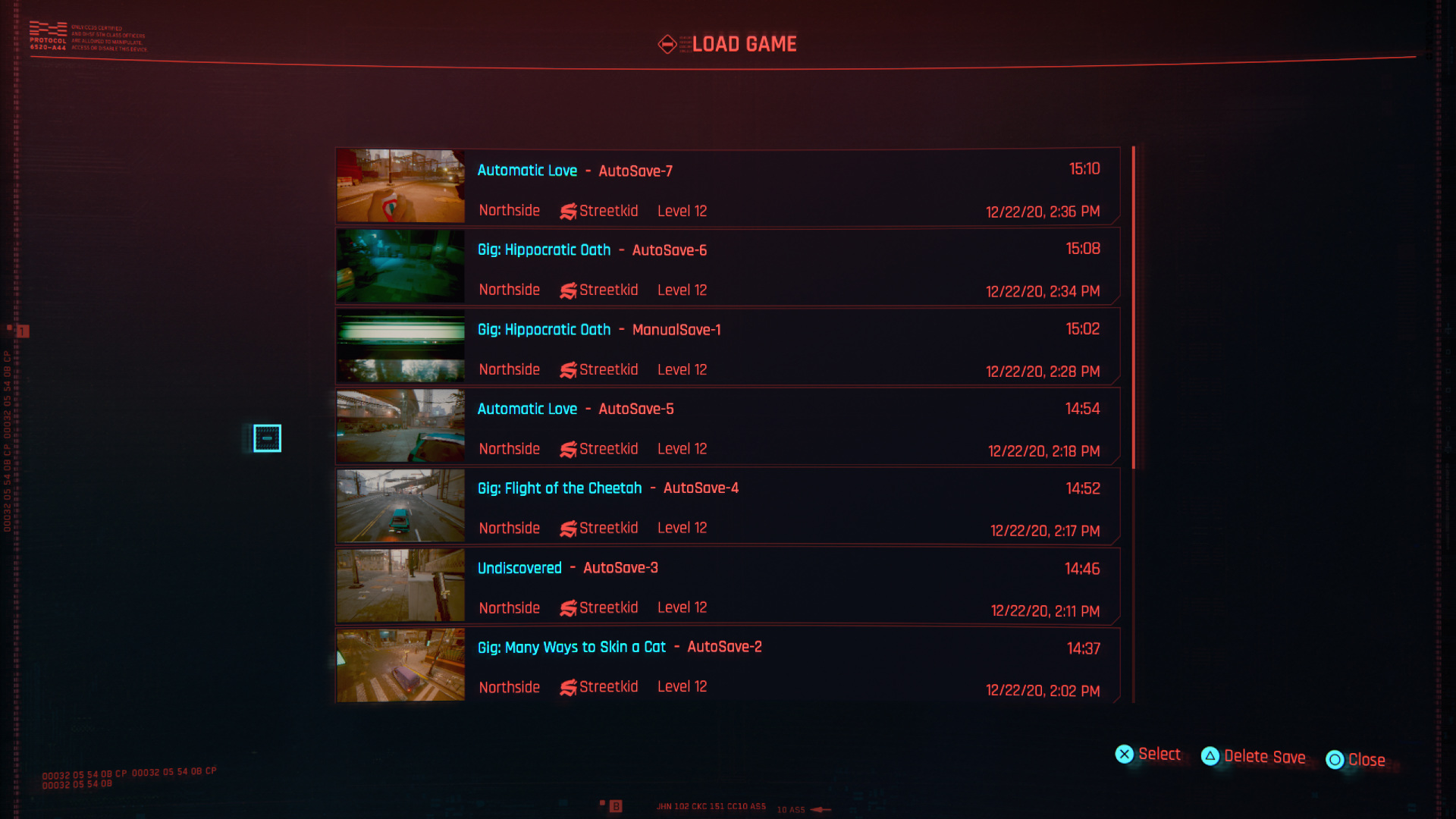
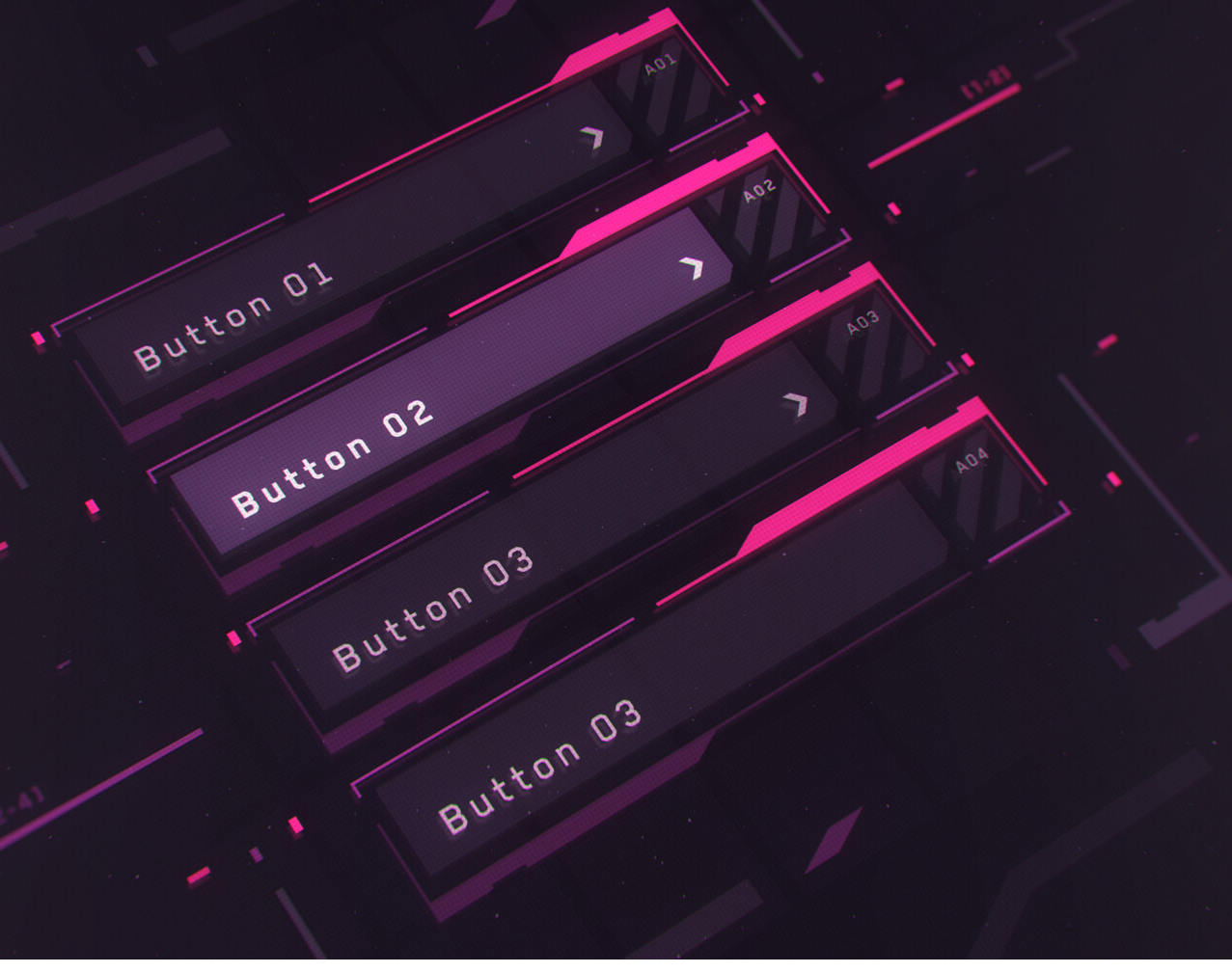
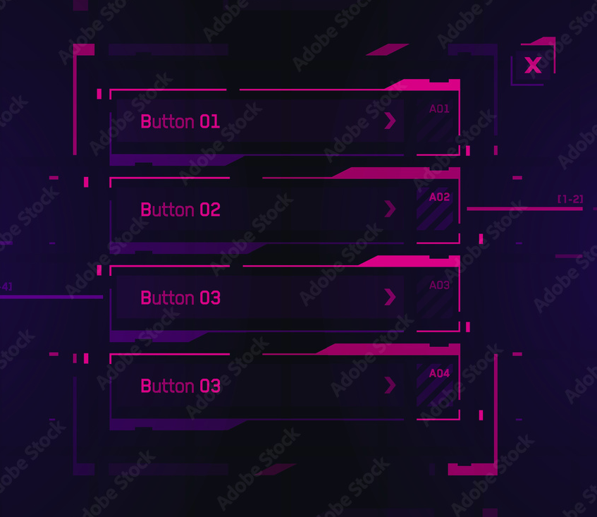
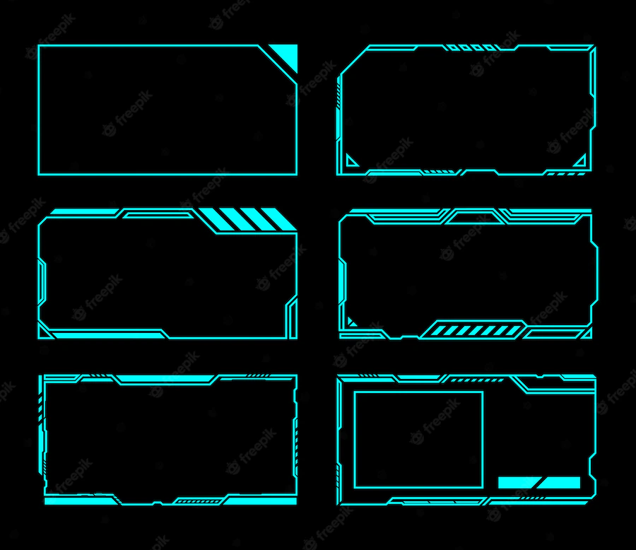
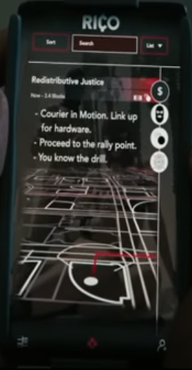
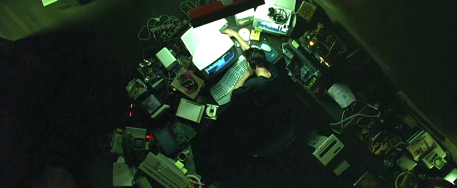
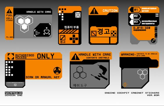
Here are some designs (among many) that initially inspired me:
Experiments
I spent too long trying to come up with an original look. Mixing and matching different elements from different works. Here are some snapshots from the many experiments I did, trying to make the perfect design. You can view my entire Figma design journey by clicking on this image.
Challenges
Responsive Crossplatform Design
The biggest challenge was coming up with a design that was cross platform and responsive; the problem with cyberpunk designs is that they are not very flexible with sizing and spacing, they will lose quality with the slightest amount of stretching or compression.
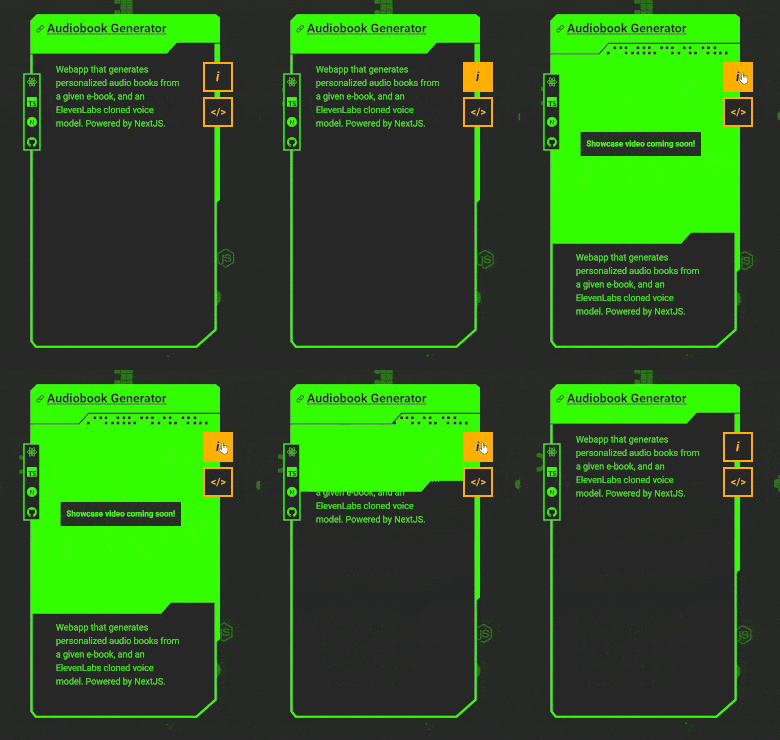
My solution was to create a decoupled card based design where content is split up into atomic units that can be individually presented; This way each card can be resized without changing the overall look of the design. To keep things interesting, I created variants for different kinds of content. On top of that to ensure the cyberpunk feel, I made these atoms float on top of an animated background, and to top it all off, I made a special background step gradient filter that mimics a CRT monitor look.
Here is a selection of the cards that I'm talking about:
SVGs!
I hit a big obstacle during implementation that involved using SVGs and animating them. I needed to add interactivity and animate them on command. As it turns out, SVGs don't play nicely with standard CSS and JavaScript; they have a world of their own. Because of this there are a couple of different ways to add them to HTML, and each technique yields you a different level of dom/css access. I won't delve too much into the details, as there are excellent resources on the web already covering that topic. Thanks to them, I was able to overcome my issues.
Namely, I found this website very insightful. It's probably the best place out there to learn about SVGs.
In addition to implementing SVGs, I also had the pleasure of learning how to write entire SVGs from scratch, by hand. It seemed daunting at first when looking at the code for an SVG, but once I familiarized myself, it wasn't so bad. Writing your own SVG feels like magic, actually, because not only can you create whatever perfectly smooth and scalable shape you want, but you can also animate it and apply a whole slew of filters and effects to it. It's really, really fun!
Animations in SVG are very smooth, here's an example taken from my website
I discovered a very handy dandy tool during this process, enter SVG VSCode extension. It gives you a live preview as you write SVGs right in your editor, and comes with a free SVG optimizer! Remember to always optimize your SVGs, it can save you kilobytes, slashing page load times by entire seconds overall! And best of all it doesn't affect the final result whatsoever. It works by reducing the number of vertices in SVG paths (just note that once you optimize it, it wont be easily human readable so make sure to finalize your SVG beforehand).
I ended up using different methods for implementing SVGs for different uses. Here's a diagram that sums it up:
Here's a cheatsheet (from svgontheweb.com) that guided my decisions.
The most difficult task was triggering SVG animations from outside the SVG while not using inline SVGs. I specifically wanted to keep my JSX clear of any SVG code due to its bulky nature. Additionally, inline SVGs don't get cached. My other options were using an object tag which grants all access but it's a little annoying to access its dom, and the other option was to put all my svg inside symbol tags inside a large svg file, and use use tags to refer to those symbols everywhere in my jsx. I used use tags as much as possible, except for interactive ones those needed js access so I opted for object tag.
Animation Timing in React
A minor challenge was animating the canvas and allowing it to resize along with window resize events. As well as rescaling everything and downscaling to optimize performance on smaller devices. Because there was boundary collision detection happening on every frame. One issue that I kept running into was the old animation not being disposed of properly before starting a new one. It would eventually lag the window out of oblivion. I ended up breaking up the code into small logical chunks that would trigger in a series of useEffects that would sort of pass the torch to the next function to manage events and make sure the animation was only started once.
Also the images for the canvas element were prefetched onload before starting the animation then made into image tags that would then be spawned and manipulated inside the canvas element. All of this also was cache enabled ofcourse.
Lessons Learned
Recently I found out I can actually recreate most of the graphics from my website using good ole clip-path in css, which makes a huge difference!
-
Performance would get something like a 10x boost.
-
All the graphics would be more flexible across screen sizes. As mentioned earlier, one major problem with SVG shapes is that they are vulnerable to compression and streching, if you plan on changing the aspect ratio of anything outside a basic shape, avoid SVGs. There are ways of dealing with that if you just have a card with cut corners that you want to keep the same size as the card size changes, but none of them make sense in terms of amount of effort involved. I opted for carefully placed breakpoint styles and managed to remedy it as best I could.
Here's a side-by-side comparison between SVG and clip-path and how they fare against stretching and compressing. Click on the image to go to the codepen with the html card, the svg version is available in the design figma file which you can find above.
- JS access is much more simplified and animations can be done much easier with plain css properties rather than svg animation frames. This not only allows for finer control over the card animation itself but also syncs better with other animations happening in the content of the card which are supposed to match the card graphic movements.
Conclusion
I learned a lot during this project, most of it was related to making better designs, and using scalable graphics on the web.
Moving Forward
I just finished this blog that you're reading on, and as soon as I finished it I was displeased with the design. I tried very hard to design it with the same aesthetic as the website but it just doesn't look good and I don't know how to make it work with this design. I will redesign it shortly. I'll probably redesign my website as well. But right now I gotta focus on finding a job and move on to new projects.
If you made it this far remember this:

